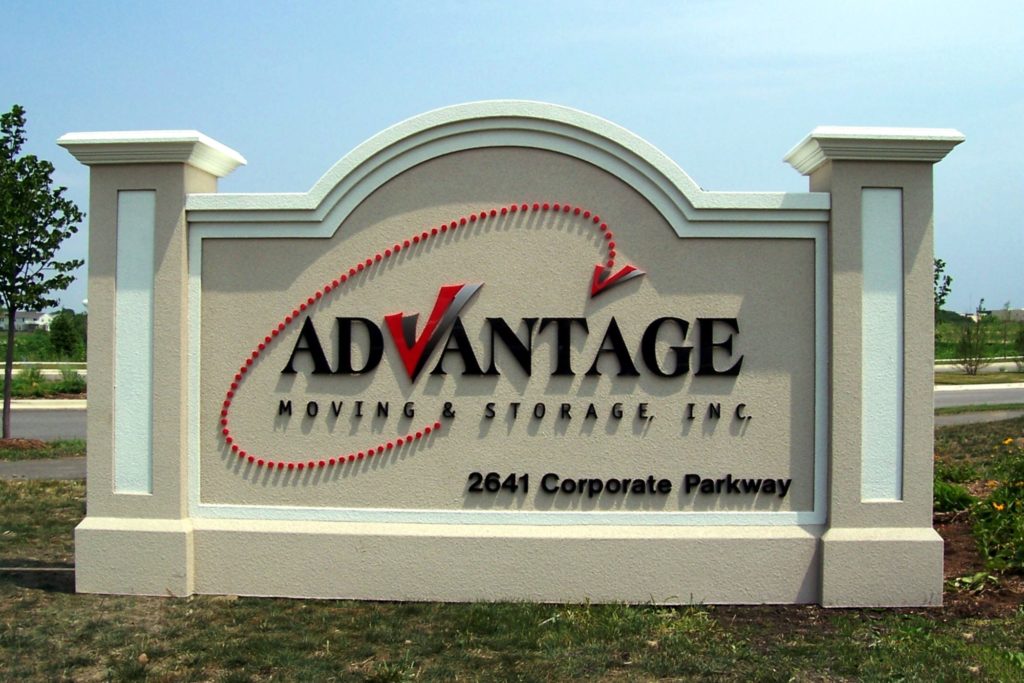
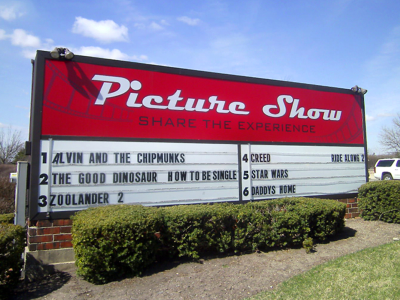
Reel in foot traffic with monument signs in Chicago. People who might not have thought about stopping by will do so now that they see your sign. Ideally, the monument marker will be sufficiently close to your entryway that motorists easily access your parking lot. While these signs come in all sizes and shapes, going big offers you several distinct advantages.
Big Monument Signs Give Customers Reasons to Come In
 The upper half of the monument sign features your corporate information. It shows your company’s name and brand colors. You might even include some niche-specific images. The bottom half is a reader board. Manual reader boards or digital ones make it easy to communicate with your customers. There, you post the reasons why they should visit you. Display product details that make your location irresistible. Frequently, these signs look like small billboards.
Digital Reader Boards Integrate into Established Monuments and Encourage Timely Communication
 Tell your customers about the latest products. For banks, this might mean the current interest rates on savings accounts or loan products. For schools, the reader board is essential when communicating information about fundraisers, early dismissals, or special enrollment events. Parents who want to check out the school will make a note of these details. The digital reader board does not have to stand alone. Instead, it quickly becomes part of an already established brick and mortar monument sign.
Use Bold Colors to Your Advantage
A tall and wide monument sign is always a good option. Make it stand out more by featuring bold colors. The combination of a deep blue backdrop and white 3D letters is not something that you can ignore. It differentiates itself from the landscape and any structure that is near it. Marketing and branding with this type of sign should be easy. Of course, you might choose different colors, too. If your corporate palette is more on the pastel side, consider focusing on a dark backdrop that displays the light tones of your lettering.
Incorporate Visual Aesthetics in the Sign’s Form
 The typical monument sign takes on a rectangular shape. Why not go with a variation on the theme. For example, include corners and right angles to draw the eye. Suddenly, it is no longer just a plain wall, but it is now a monument with a certain amount of eye candy appeal. You do not have to stop there, of course. Some business owners have begun experimenting with cylindrical shapes and obelisk formations. The goal is to get the attention of passersby and motorists. With the right form, it is a snap.
Do You Want to Know More about Effective Monument Signs in Chicago?
Do not leave your brand message’s effectiveness to chance. With the right size, shape, and color combination, it is easy to attract attention. Moreover, when you have a highly visible spot that is conveniently located at your property’s entryway, this signage solution is an essential aspect of the impulse stop. Contact our experts today to learn more about your options.

