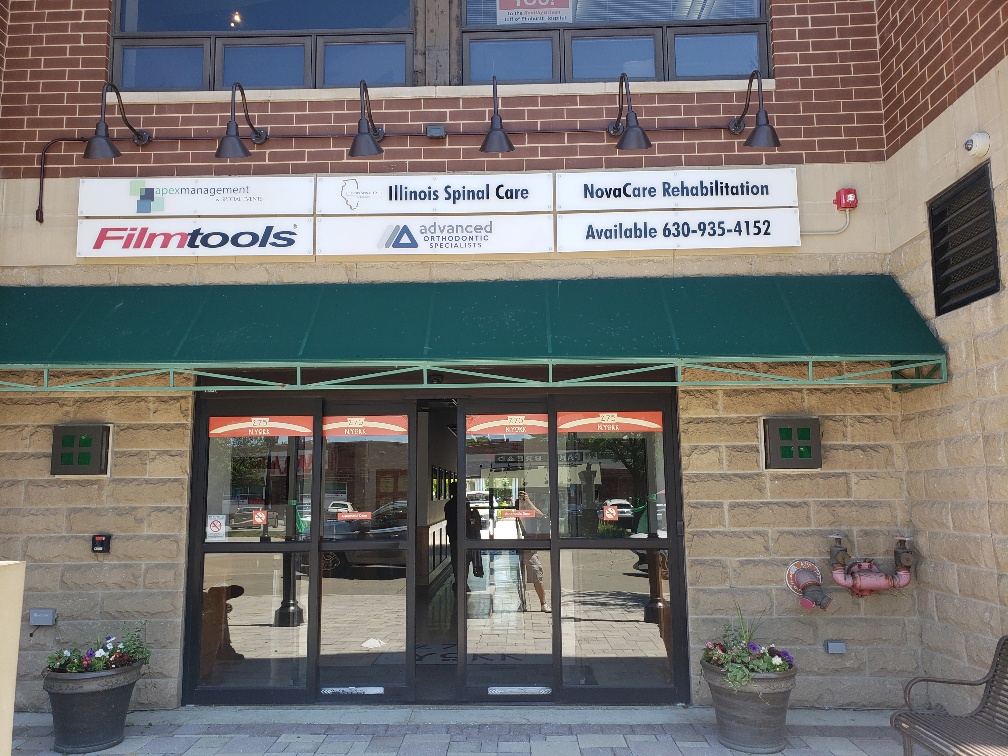
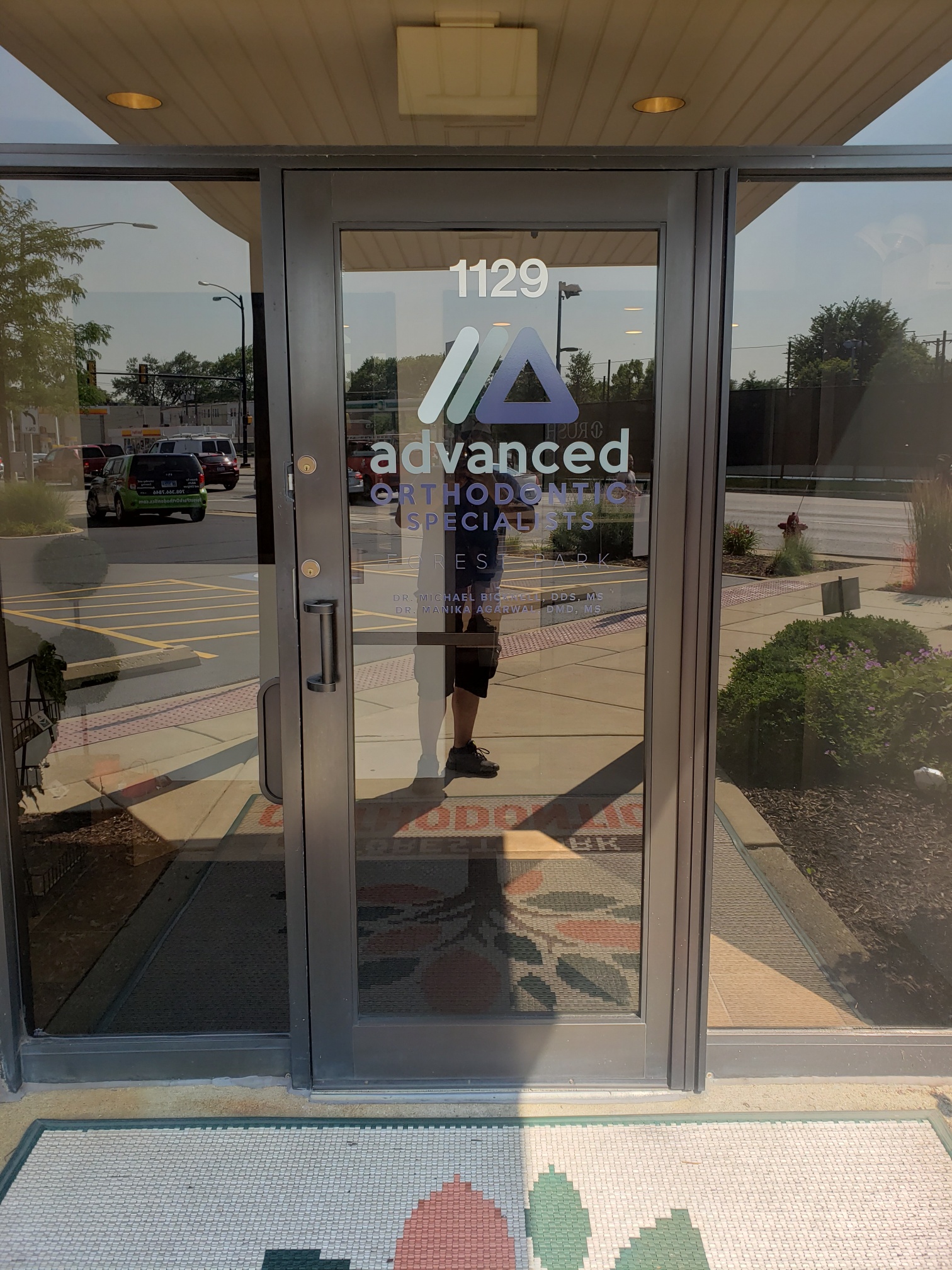
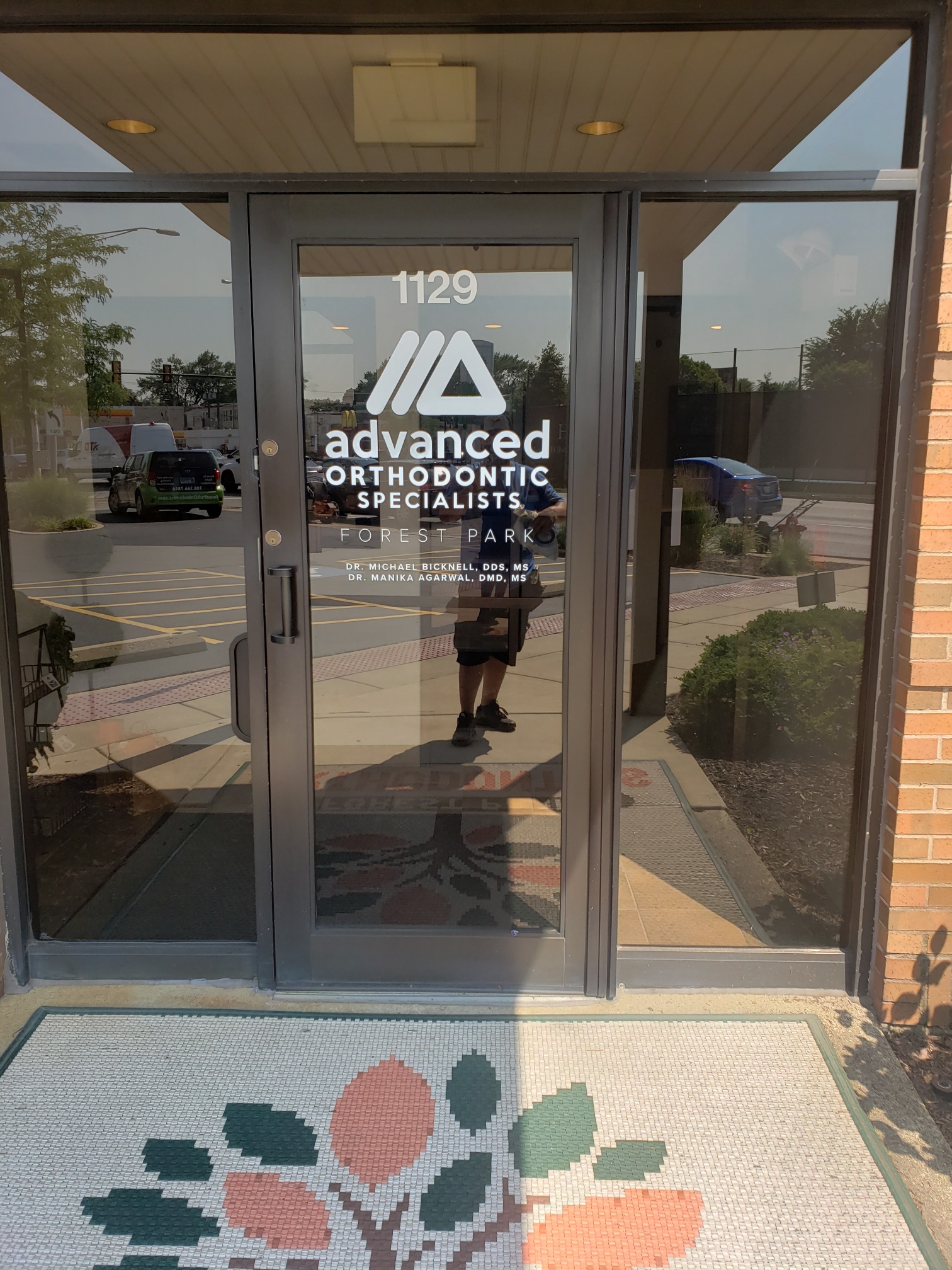
Advanced Orthodontic Specialists maintains offices in Elmhurst and Forest Park. More than just an orthodontic office, this dental health clinic understands that it is in the people business and approaches care with an eye on providing positive experiences. The medical office recently changed its color displays and needed assistance with rebranding signs in Elmhurst and Forest Park, IL.
Participating in the Monochromatic Trend Gives an Edge

Rebranding is a practice that allows a company to adjust its logo, lettering, and color presentation to appeal to a new or changing consumer demographic. It is as suitable for an orthodontist’s office as it is for a soft drink bottling business.
Moreover, monochromatic sign design is one of the hottest trends in signage right now. It focuses attention on the combination of logo and font setups, which is essential for brand-building and name recognition. For Advanced Orthodontic Specialists, the new signage would embrace both aspects.
Our technicians worked on the sign design to eliminate the color. Instead, we focused on the white and gray areas of the specs. For the building sign, the clinic added a tenant panel to an existing presentation of similar boards. Its new color play fits in perfectly but stands out because of the logo design.
Next, we designed, produced, and installed door graphics for the locations. They emphasize the logo and corporate name. In smaller lettering, we identified the doctors doing business at the sites. Taking this step made sense because it allowed the company to boost wayfinding by featuring a secondary identification tool.
Why Keeping up with Signage Trends is a Good Idea

Whereas rebranding is a step a company takes at specific times to remain in step with their customer base, following signage trends is something that boosts your relevance within a niche. Sure, you do not need to follow each fad or have a sign that stays in step with the products that other business owners around you are featuring. However, staying ahead of your field is always a good move.
What is the Monochromatic Color Scheme That is Becoming so Popular?

Every so often, a new trend develops that has longevity. A case in point is the move toward LED illumination as opposed to other light sources. The display of monochromatic sign designs is another example.
- Single hue. Choose a unique base hue that exemplifies your brand tone. Frequently, this step allows you to capitalize on the brand colors working well for you.
- Associated tones. From the single base color, you choose the tones you want to work with. Therefore, monochromatic color signs are anything but boring. Instead, they are exciting products where tints, shades, and tones combine to create eye candy.
- Chic signage. The result of a well-designed monochromatic signage setup is a classy display that catches the attention of passersby. Whereas other businesses use signage that emphasizes a broad range of colors, the monochromatic design does the exact opposite – and it works!
Do You Need Monochromatic or Rebranding Signs in Elmhurst and Forest Park, IL?
Our sign shop can help. We routinely assist clients with the design or execution of a rebranding project. Besides that, our shop is at the forefront of the monochromatic sign revolution. Contact us today to learn more about this exciting trend!

