Government statistics show that your eatery is competing against at least 7,299 others. Some have AAA ratings. Others have Michelin stars. Then there are the James Beard and Bib Gourmand winning restaurants. In addition, do not forget the dog-friendly eateries. Effectively competing means having the right Chicago restaurant signs that bring foot traffic and constantly keep your brand in front of the prospective guest. What are the options?
Panera Bread Creates a Beacon with Channel Letters
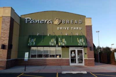
Customers recognize the green lettering with the yellow logo. However, seeing it larger than life on the façade of a building is a great way to draw attention to your location. Most importantly, channel letters light up after dark, making you highly visible, particularly when other businesses surround you. Our technicians shape the channel letters in your chosen font and paint the style elements using your brand palette.
Menu Board Design Focuses Attention on Your Brand’s Exclusivity
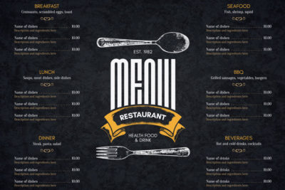
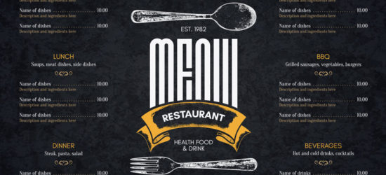
The color play of gold on black is a fantastic way to showcase that your restaurant is a cut above. To stand out, this menu board gives the impression of a colorful collection of the latest specials and fresh foods available for guests. You will notice that this product takes on the look and shape of a traditional blackboard, which underscores the handcrafted element.
Smashburger Whets the Appetite with Window Graphics
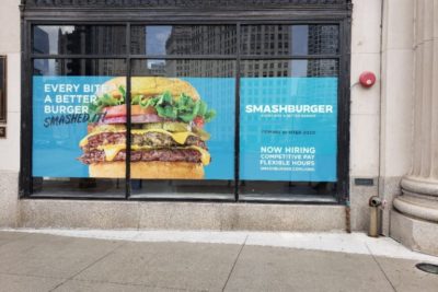
Against the brand colors that serve as the background, the company opted for a feature photo of its signature burger. The product looks appetizing, and you can just imagine biting into this carefully curated pile of toppings. Rather than placing too much wording on this advertisement, the eatery chose to feature the corporate persona along with its tagline. This window graphic is an excellent placeholder for the restaurant that was still building out its venue.
Naf Naf Wall Graphics Bring Your Brand Message to the Inside
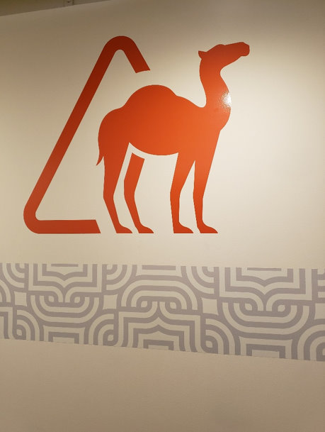
When your symbol is on every piece of sales collateral, remember to represent it prominently inside and outside. Wall graphics are excellent for setting the mood inside your eatery. Put them on A-frames and other signs, allowing for the transition from the exterior to the interior. We recommend pairing the wall graphics with matching window graphics.
Beerhead Bar and Eatery Advertises with Logo Cabinet Signs
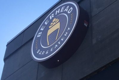
The logo cabinet is another building sign that draws attention to your location. It illuminates from within. However, unlike channel letters, it allows for multi-colored layering of different features. Conversely, you might opt for a facing with gradient color changes. We can form these signs in any shape you like, including custom forms.
Have we piqued your interest in taking a closer look at essential Chicago restaurant signs? Do you have one of these signs but want to boost your game by adding more? Vital Signs USA routinely works with members of the Chicago business communities as well as those in and around Elmhurst, Oak Brook, Lombard, Naperville, or beyond. Call us today at 630-832-9600 to learn more about your options!

