POWERFUL BRANDS ARE RELYING ON SIGNAGE MORE THAN EVER
Marketers and small business owners have never been more sensitive to the power of branding, and as we enter 2020, the focus is on creative branding in physical spaces. The way companies use signage and vinyl wrapping is evolving to keep pace with these shifts in how retailers and service providers alike think about their brand in their physical plant.
We see 5 major trends emerging:
1. CREATIVE USE OF NEGATIVE SPACE WITH VINYL WRAPS
We have been caught in a Scandinavian-furniture vortex of stark angles and empty walls for over a decade. That trend is starting to lose steam — it’s being replaced by colorful accoutrements that inject retail spaces with a major dose of brand personality.
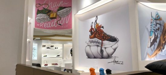
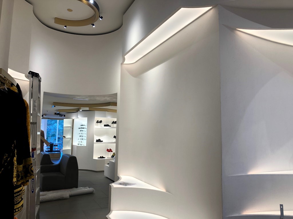
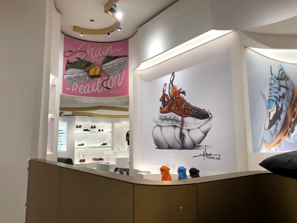
For example, Versace is using big, bold vinyl prints to dress up blank, neutral walls. The vinyl here is the right medium for these images because it can be tailored to the irregularly-shaped spaces like the sculpted curves of these walls.
Vinyl wraps are perfect for walls and windows because of its versatility. If you have a space that is oddly shaped (or just flat and empty), you can fill it with a creative image on vinyl. Whether you go with something traditional and classy or eye-popping and trendy, you can reinforce your brand and make your customers’ experience unforgettable.
2. “LITTLE DETAILS” DECALS
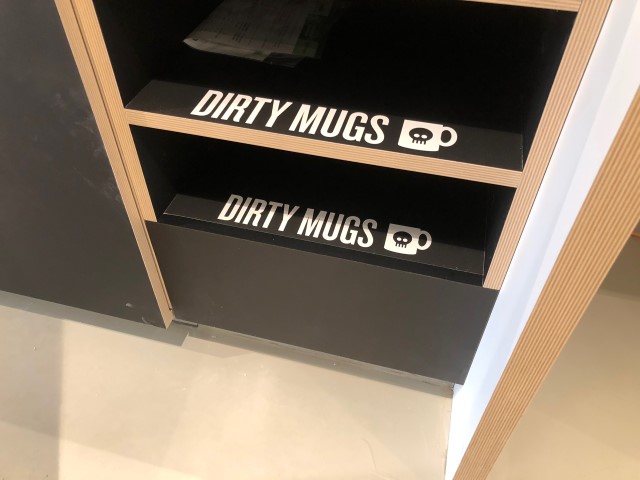
Nothing shows an attention to detail in your brand personality like marking workspaces with decals that give the workplace a distinctive look and feel to match the brand. Whether the brand is warm, cheeky, or sophisticated, well-placed decals can give the space a lift in all the right ways.
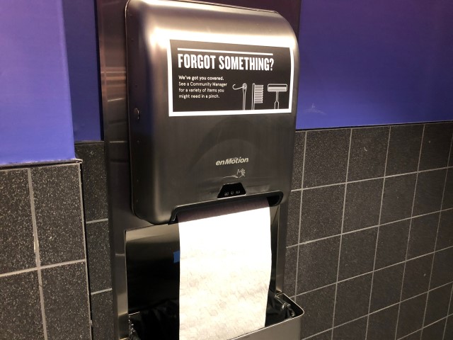
WeWork, the workspace sharing company that is growing in popularity, attends to these details with spunk. Vital Signs USA recently placed decals for WeWork, and the results show how much these “little details” decals add to the space. In the case of WeWork, the decals give the space-sharers a guide, making the space more comfortable for them.
Decals of there sort that WeWork uses are an example of the growing understanding that marketing needs to inform every client experience. If your clients are in your space, then your marketing message should be consistent from ceiling to floor, from website to door.
3. MAKING OPEN SPACES SAFE
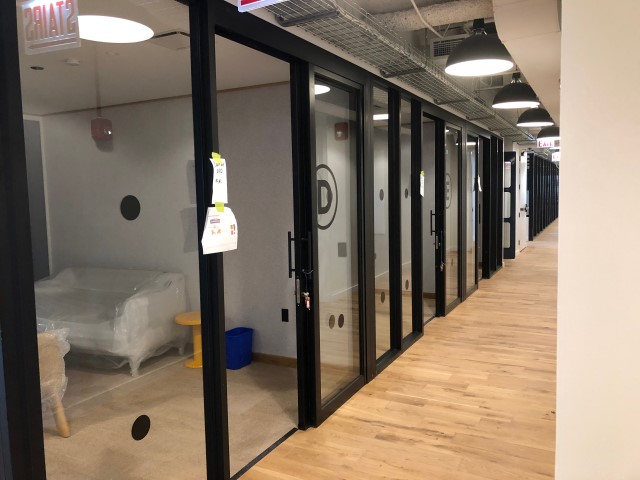
The people have spoken: Transparent glass walls feed our love of open spaces. Office spaces continue to adopt glass to outfit offices and conference rooms to combat the memories of the stereotypical claustrophobic offices of yesteryear.
But with much glass comes much responsibility. Enter the safety decal. These decals (sometimes called collision dots) are a chic, understated, and attractive way to keep this from happening:
No one wants this to happen in their workspace — the ounce of prevention here are safety decals.
4. BRAND MINIMALISM
Companies have gone from complex, detailed logos to simpler shapes and monochromatic illustrations to give their business a more settled, effortless mark. As the rebranding craze runs its course, signage is being redone to match the newer, simpler logos that are emerging across the marketplace.
Signs might reflect a simple logo, or they might simply employ channel letters instead of a logo sign. Business owners increasingly attracted to simplicity in their branding and messaging, and their signage choices reflect that.
The key to this simplicity in signage is ease — marketers want to communicate that they are not trying too hard.
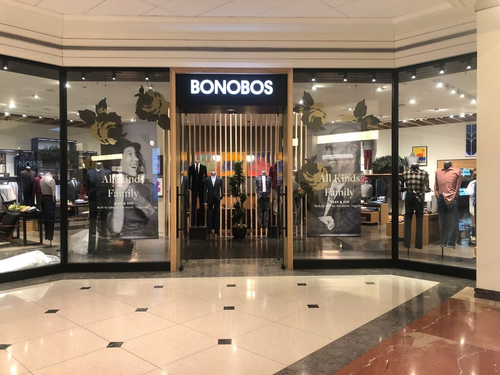
So, fancy is out; straightforward and simple is in. Bonobos recently had signage installed by Vital Signs USA. This mall storefront is a perfect example of how abandoning unnecessarily complex logos and signage for a simple, legible alternative gives the space a richly elegant feel.
5. MIXED MEDIA
Companies are increasingly using vinyl too create mixed media storefront presentations. Vinyl in conjunction with a logo or channel letter sign can create brand repetition, add to the message, or give the storefront a splash of color. We are seeing companies leverage vinyl window wraps to attract more (and different kinds of) attention.
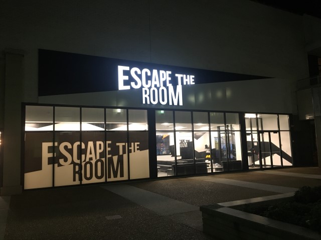
Escape the Room, for example, recently chose Vital Signs USA to create a mixed media brand display that uses both a sharp black and white logo sign and a similar, repetitious vinyl window wrap. This duplication strengthens the visual brand by maximizing its visibility both day and night to foot and vehicle traffic alike. The higher, lighted sign is easily seen both in the dark and by drivers who view it at a distance; the vinyl wrap grabs the attention of daytime viewers and eye-level foot traffic.
SIGN DESIGN: MORE IMPORTANT THAN EVER
As online spaces mature and saturate, marketers are exploring the ways their online brand and physical, in-person presence need to match to make the impressions that convert lookers into buyers. Signage is an important part of that mix, and the trends we’re seeing in sign and vinyl wrap purchases reflect that.
When you evaluate how your brand is growing and changing, Vital Signs USA will be your partner in making sure your physical space is in sync with both your web space and all the other ways you connect with your customers.
If these trends spark ideas for your space, send us your thoughts, and Vital Signs USA will work with you to turn them into stunning branded visuals.

